“What’s in a name?”, Shakespeare wrote in his famous “Romeo and Juliet”. As you remember, the entire play is based on this statement, and all main characters are trying to say that there is no difference. Well, there is a difference, each name has a meaning.
The same applies to a company’s name, which we refer to as “branding.” Understanding the founders’ intentions when choosing the company’s name is crucial.
“I didn’t want a robot arm in the logo,” said Mujin CTO and logo creator, Rosen Diankov. “Robotics has nothing to do with making the robot hardware.
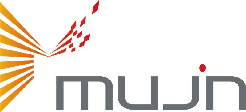
What is the first thing that comes to your mind when you see our orange/red/grey logo? It is obvious that the “M” in the logo stands for Mujin, but few of us know about the deeper meaning behind it.
Firstly, let’s explore the meaning of “mujin.” In Japanese, 無人 means unmanned, no people. Isn’t it the best way to describe what this company is actually doing? In our logo, it is written as “Mujin,” but without an “i.” “Mujin” means “no person” in Japanese, and this represents our core concept. Mujin is not just a robotics company; it is a place where the automation dream becomes a reality.


Rosen believes that Japan is the best platform to build Mujin, with all the conditions necessary for its success. Therefore, the Japanese flag is also represented in this dot.
The colors red and orange are associated with fire, symbolizing energy, strength, and passion.
Mujin’s logo is a powerful representation of the company’s mission. The convergence of disciplines symbolizes innovation, while the dot on the “i” suggests a focus on intelligence over hardware. The vibrant colors signify energy and passion, underlining Mujin’s dynamic approach in the robotics industry.
As Mujin continues to advance automation, the logo embodies our vision and limitless possibilities for the future. With innovation at its core, Mujin is poised to revolutionize robotics and inspire change worldwide.